More Than a Symbol: The Story of Our Logo
- Rochelle Amber

- Aug 29
- 2 min read
Updated: Sep 25

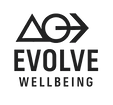
When you see a logo, you might just see shapes and lines. But for us, every part of our logo carries meaning. The triangle, the circle, and the arrow weren’t chosen at random – they were chosen with intention, to reflect the journey of wellbeing and the heart of what Evolve stands for.
🔺 The Triangle: A Foundation for Growth
The triangle is one of the strongest shapes in nature; it holds weight, offers balance, and points upward toward possibility. For us, it represents the foundations of wellbeing: mind, body, and spirit. Healing isn’t built on quick fixes; it’s built on steady grounding and the strength to rise through challenges. The triangle reminds us that growth is possible when we have balance at our base.
⭕ The Circle: Wholeness and Connection
The circle has no beginning and no end. It speaks of wholeness, continuity, and the cycles we navigate throughout life. At Evolve, the circle symbolises the holistic nature of wellbeing – we are not just one part of ourselves, but an interconnected whole. It also represents community and belonging. Just as a circle gathers and protects, we believe healing happens in connection with others, not in isolation.
➡️ The Arrow: Moving Forward
The arrow points right – toward progress, momentum, and new horizons. It’s a reminder that while reflection is important, our energy is best spent moving forward. The arrow symbolises choice, direction, and the courage to step into the future with hope. In our work, this is what we hold space for: helping people take the next step, however small, toward growth and healing.
Together, They Tell a Story
Individually, each symbol holds meaning. But together, the triangle, circle, and arrow create a story:
We ground ourselves in a strong foundation (triangle).
We honour the whole of who we are, in connection with others (circle).
We move forward with courage and intention (arrow).
That is the journey of Evolving Wellbeing. And that is what our logo represents, not just a design, but an invitation: to rise, to reconnect, and to keep moving forward.
Comments